
Making a good video game User Interface (UI) is almost an art form. One must think about ease of use, aesthetics, function, speed and any number of other factors great and small. The design that goes into these interfaces is an often forgotten but important factor in our enjoyment. In today’s article, we will be looking at some of the more common mistakes in video game UI design.
Video game UI design principle is not quite the same as the principle used in modern OSes or devices. In most video games the UI is actually a necessary evil for the game to function. Sure, genres like Tycoons or some strategy titles are played mostly or entirely in some UI abstraction, but for most other genres or titles, spending a lot of time in a pretty UI is actually worse than spending little time interacting with an ugly UI. This brings me to the first issue…
Slow to navigate UI

Not the most egregious example of a slow UI, but it could have been much faster.
Current design trends are influenced by a game’s cross platform development cycle. To minimize costs, developers create a single UI, then tweak it for different platforms and/or control schemes. That is not an outright bad thing; and no one should fault developers for wanting to optimize their time spent on issues not crucial to their title. But it does mean we PC gamers are sometimes left wanting more.
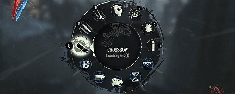
The pip-boy activation animation lasts under a second. Fine for a short game, but not Fallout 3.
What looks good on a distant TV and on a monitor up close are not quite the same. Controllers are also generally not the best for navigation, so developers have to separate them into menus, types, order them by the X and Y-axis, and give them big, easy-to-read names and icons, among other things. If the artists are skilled, the UI will generally look good and be satisfying the first few times it’s used. The problem is… what happens after 10 hours of gameplay? Navigating several different menus to do simple stuff will become annoying. Sometimes a more cluttered, maybe less beautiful UI is preferable because it is fast to use and will not get as annoying 20 hours down the line.

Not an ugly design, but one tuned for usability over aesthetics. Once you get used to it, it is very fast to use, and perfect for a long game!
The issue boils down to this: developers should try to think about how gamers will see the UI not just an hour down the line, but 10-20 hours even, especially if it is a long or high in replayability title. Developers ought not assume players will “get used to” doing something in a non-optimal way.
Consistency flaws

All credit to mockplus for this one!
This one should be obvious and, thankfully, most games are good here… most of the time. Once an internal logic for the UI is settled on, the developer can please gamers that little bit more by sticking to it.

I don’t mean that a mash-up of different concepts or exceptions isn’t permissible. In fact, this is where the “art form” part comes in. However, exceptions or mash-ups must be considered very carefully as they may be exciting or simply incompetent. There is a very fine line between the two. In addition, when they are designing inputs such as buttons or sliders, designers would do well to make them all work universally. If some sliders loop back (not a good idea usually), they should all loop back.
Not using the screen space wisely

In this screenshot from Oblivion, around 75% of the screen is not used.
When using an interface, players must get information quickly. Maximizing useful screen space is of the utmost importance here, but not all developers realize that.

Wasting space is not always a cardinal sin. It really depends on the menu being displayed. However, maps and quests, encyclopedias, books, statistics, and inventories generally need the full screen to be useful.

This screenshot from Morrowind may not be perfect, but at least it is using the entire screen wisely!
Minimalism is awesome, but it is not something you sacrifice efficiency for!
Try to make it immersive

This is not bad in terms of usability, but it is flat compared to the game’s subject matter.
Designers are often unsure how to make the UI a part of the game world. Well, if diegetic interfaces are not going to be used for whatever reason, one hopes the interface looks as if it belongs in the world of the title.

Beautiful, easy to read, fits the game world!
Try to identify the genre, period, nationality or culture of the world the players inhabit. Make it fit the universe, the themes and ideas. If used wisely, some style will make the experience better.
This concludes our brief overview of common mistakes in user interface design. We hope it helps future gamers and developers alike. While not crucial, a good interface really makes the experience that little bit better for us all!